
Challenge #2
Hi there,
We're a small coffee shop chain located in Seattle, WA with five locations. Our current logo is just text using a default font but now it's time for an update!
The Grind prides itself on natural and local ingredients. For our new logo, we actually do not want to use any browns! So many coffee shops around here use brown and we'd like to stand out. Maybe oranges, green, other earth tones, etc. could work well.
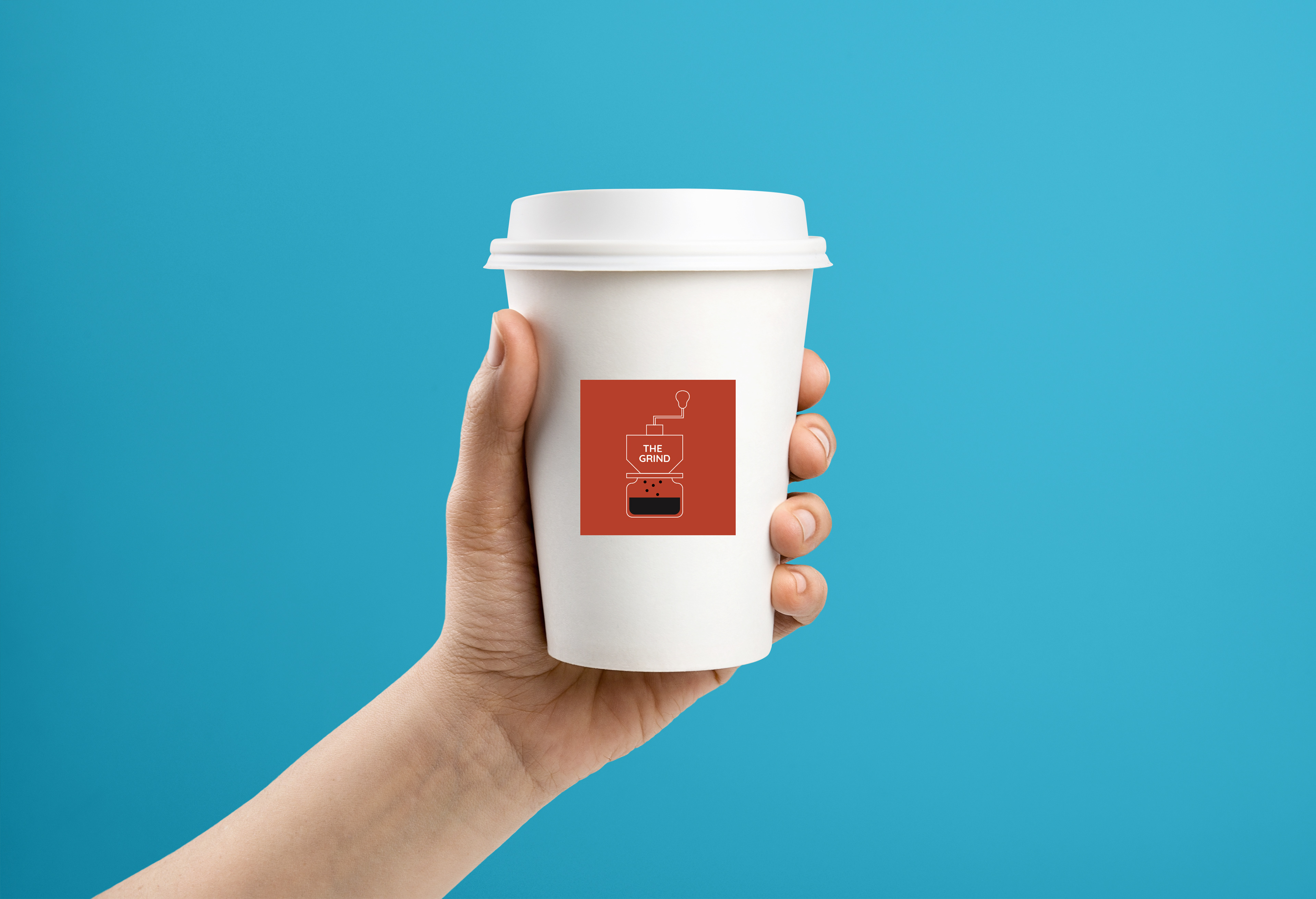
This logo will primarily be used as our store sign, on menus, and on coffee cups and merchandise. The Grind logo could be text based or have an icon, we're open to either/both. We're open to using symbols that represent coffee such as the coffee bean, plant, grounds, coffee cup, etc.!
I'm attaching a few example of logos we really dig for some inspiration. We like a somewhat clean look.
Thanks,
Edgar Martin
The Grind Cofee Shop
We're a small coffee shop chain located in Seattle, WA with five locations. Our current logo is just text using a default font but now it's time for an update!
The Grind prides itself on natural and local ingredients. For our new logo, we actually do not want to use any browns! So many coffee shops around here use brown and we'd like to stand out. Maybe oranges, green, other earth tones, etc. could work well.
This logo will primarily be used as our store sign, on menus, and on coffee cups and merchandise. The Grind logo could be text based or have an icon, we're open to either/both. We're open to using symbols that represent coffee such as the coffee bean, plant, grounds, coffee cup, etc.!
I'm attaching a few example of logos we really dig for some inspiration. We like a somewhat clean look.
Thanks,
Edgar Martin
The Grind Cofee Shop