Challenging my self over the next thirty days with the Thirty Logos Design Challenge.

Challenge #1
Hey Designer!
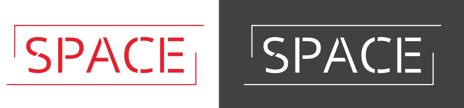
I'm Mary, the project coordinator at Space. We're so happy to haveyou work on our logo design! Space is building coworking offices so that freelancers and small startup companies have a stunning office to work out of without paying the big bucks to buy or lease a large building.
We offer rentable offices for teams of 1 to 12 in beautiful areas across the world including Austin, New York City, Raleigh, Chicago, San Francisco, and London. These offices are also great for people workingremote for larger companies.
For the Space logo, we want to capture the idea of a personal, modern, and fun shared office space. We would be open to some kind of icon or using the text "Space" to represent the company. We don't have any requirements in terms of colors, text, icon, or otherwise. Have fun with some ideas!
And if this helps, some of our competitors are Industrious and WeWork.
Regards,
Mary Anderson
Space - Project Coordinator

Challenge #2
Hi there,
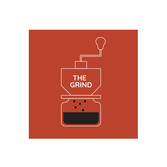
We're a small coffee shop chain located in Seattle, WA with five locations. Our current logo is just text using a default font but now it's time for an update!
The Grind prides itself on natural and local ingredients. For our new logo, we actually do not want to use any browns! So many coffee shops around here use brown and we'd like to stand out. Maybe oranges, green, other earth tones, etc. could work well.
This logo will primarily be used as our store sign, on menus, and on coffee cups and merchandise. The Grind logo could be text based or have an icon, we're open to either/both. We're open to using symbols that represent coffee such as the coffee bean, plant, grounds, coffee cup, etc.!
I'm attaching a few example of logos we really dig for some inspiration. We like a somewhat clean look.
Thanks,
Edgar Martin
The Grind Cofee Shop